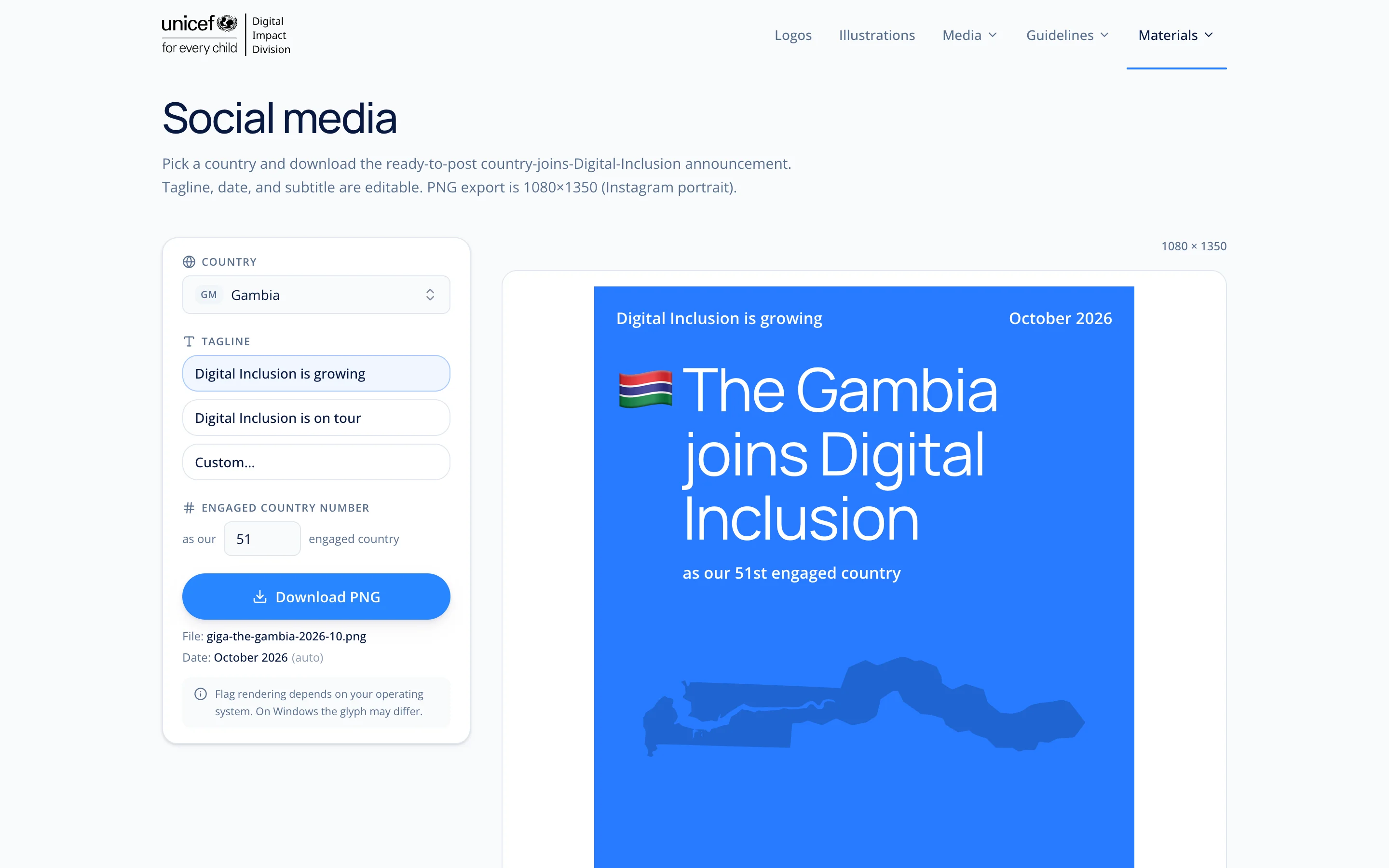
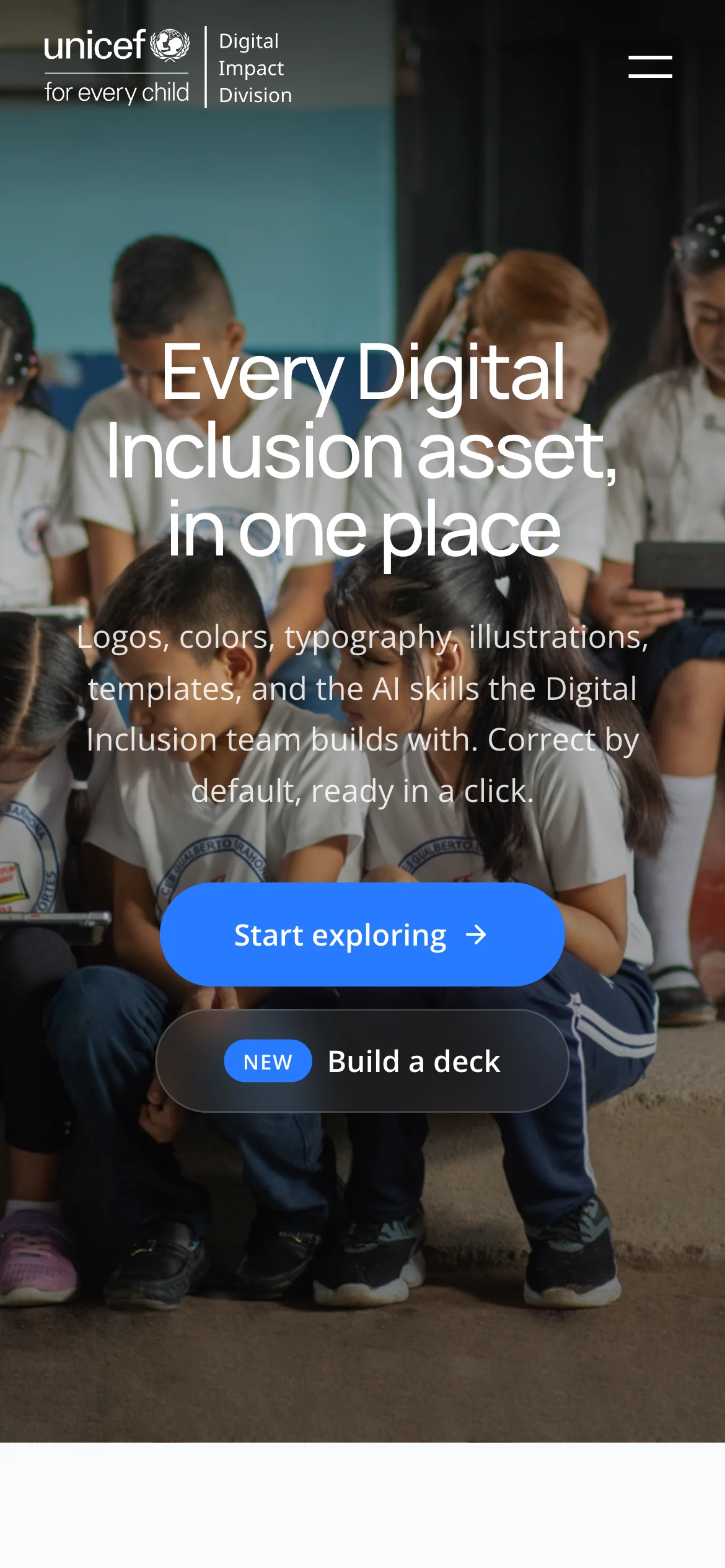
UNICEF Digital Inclusion Brand Asset Manager
One place for logos, colours, type, video guidelines and maps. Colleagues and partners serve themselves.
- Role
- Designer and builder, personal initiative
- Period
- 2025 to 2026
- Stack
- Next.js 16React 19TailwindMapLibre 5three.jsFramer MotionRemotion
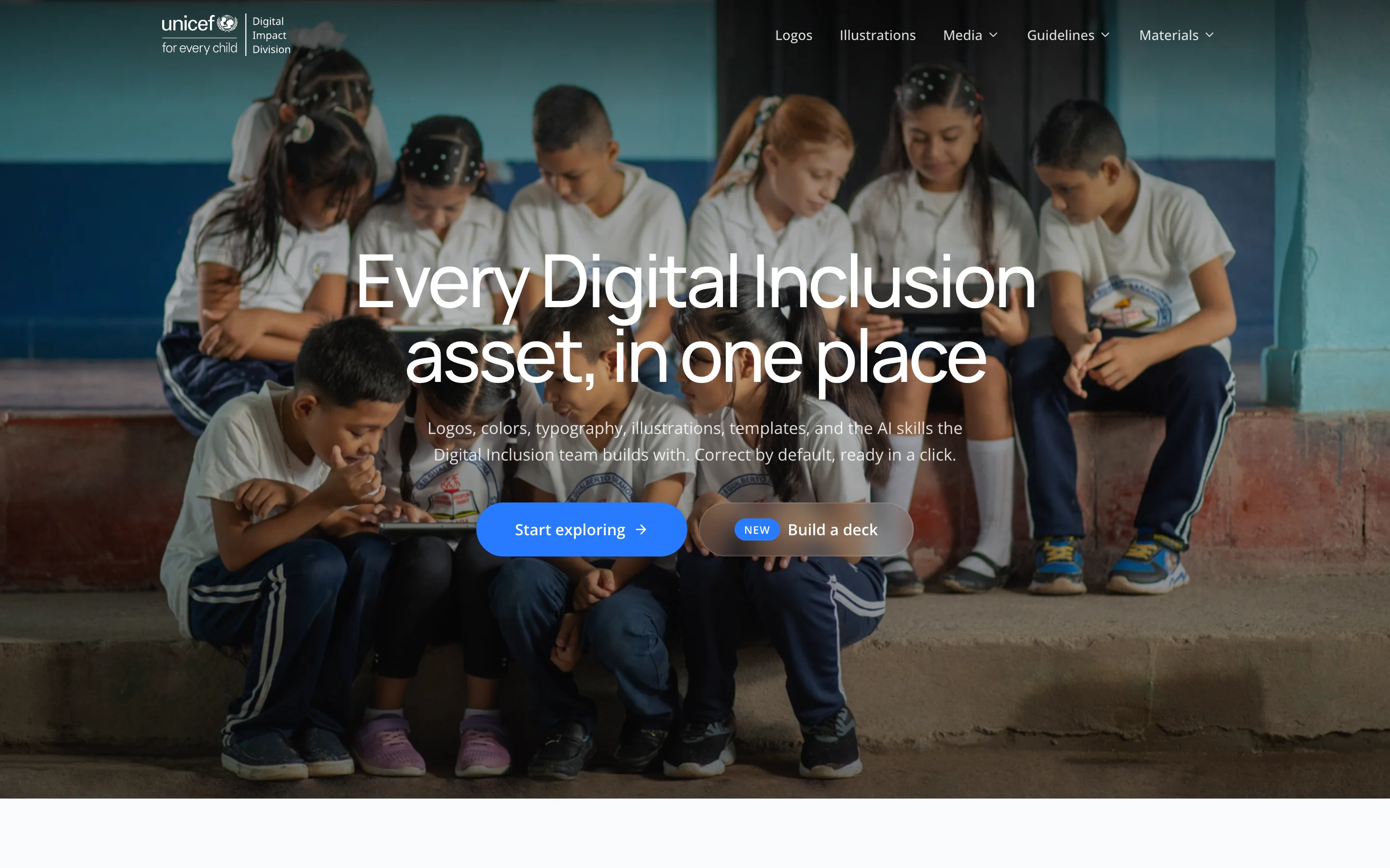
I designed and built a self service platform for internal teams and external partners to access, preview, and export Giga brand assets. No more email requests, no scattered zip files, no waiting for someone to send the right logo. This reduced friction for teams working on communications, reduced dependency on design, and gave the brand a consistent front door.
The needs
Internal stakeholders and external partners needed fast, autonomous access to Giga brand assets: logos in the right format and color variant, hex codes, and typography. The existing situation had no dedicated tool. Assets lived across SharePoint folders and Notion pages, inconsistently maintained. Every request ended up as a Slack message to the design team, slowing everyone down and introducing brand inconsistency.
Before
Brand assets were distributed manually. There was no canonical source. Partners received whichever file version was easiest to find, not necessarily the correct one. The design team spent recurring time on asset delivery instead of design work.
Exploration phase
I mapped how different user types interacted with brand assets: internal colleagues preparing decks and communications, external vendors building co-branded materials, and new joiners trying to understand the brand for the first time. Three common patterns emerged:
- People didn't know which logo variant to use in which context.
- Exporting in the right format required design software most people didn't have.
- There was no guidance embedded in the tool itself, so even when assets were shared, usage errors happened downstream.
Let's see the result
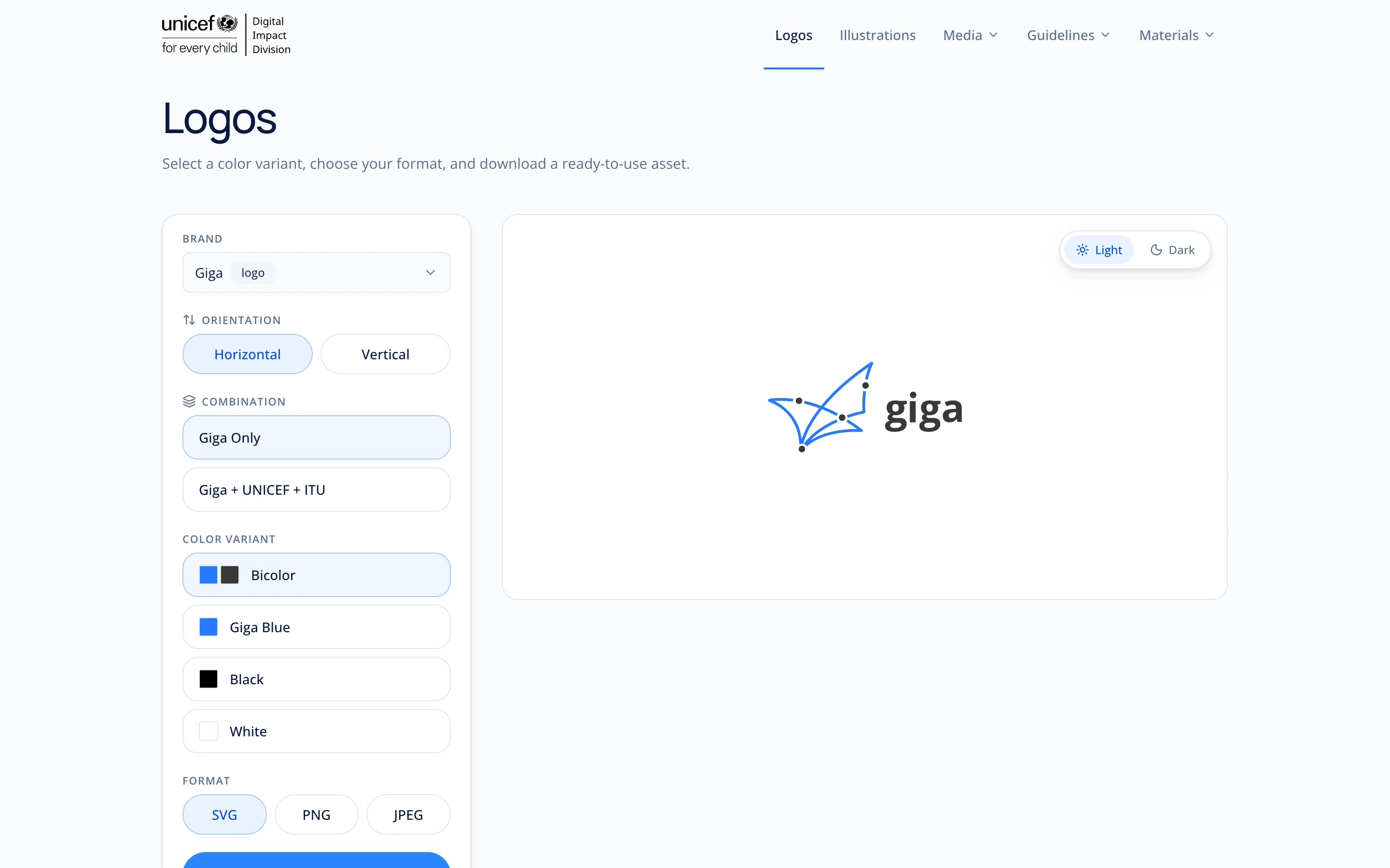
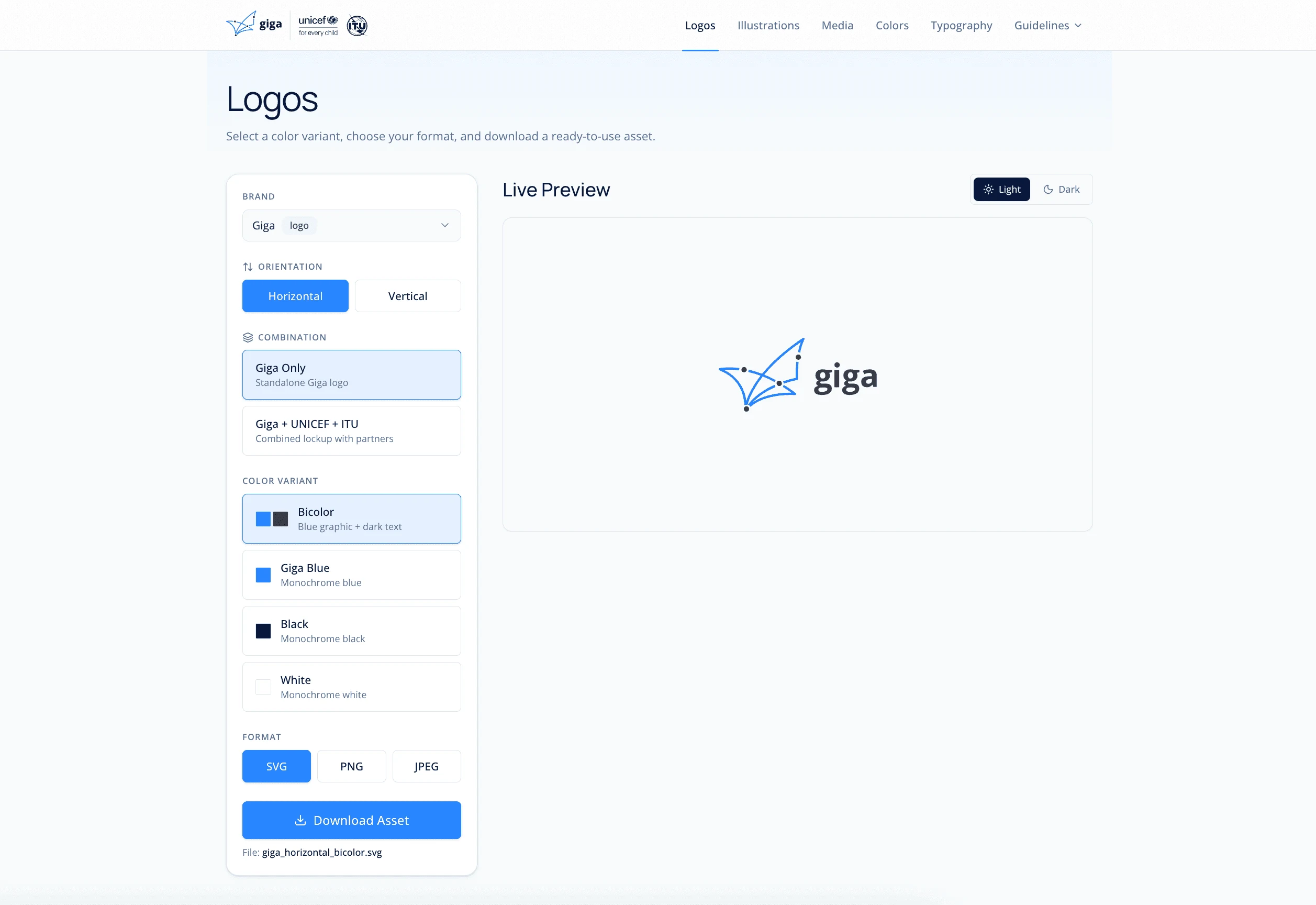
1. Logo library with contextual guidance. A browsable library of all Giga logo variants (color, white, black, monochrome) with contextual labels explaining when to use each. One click to preview, one click to export in SVG, PNG, or PDF.
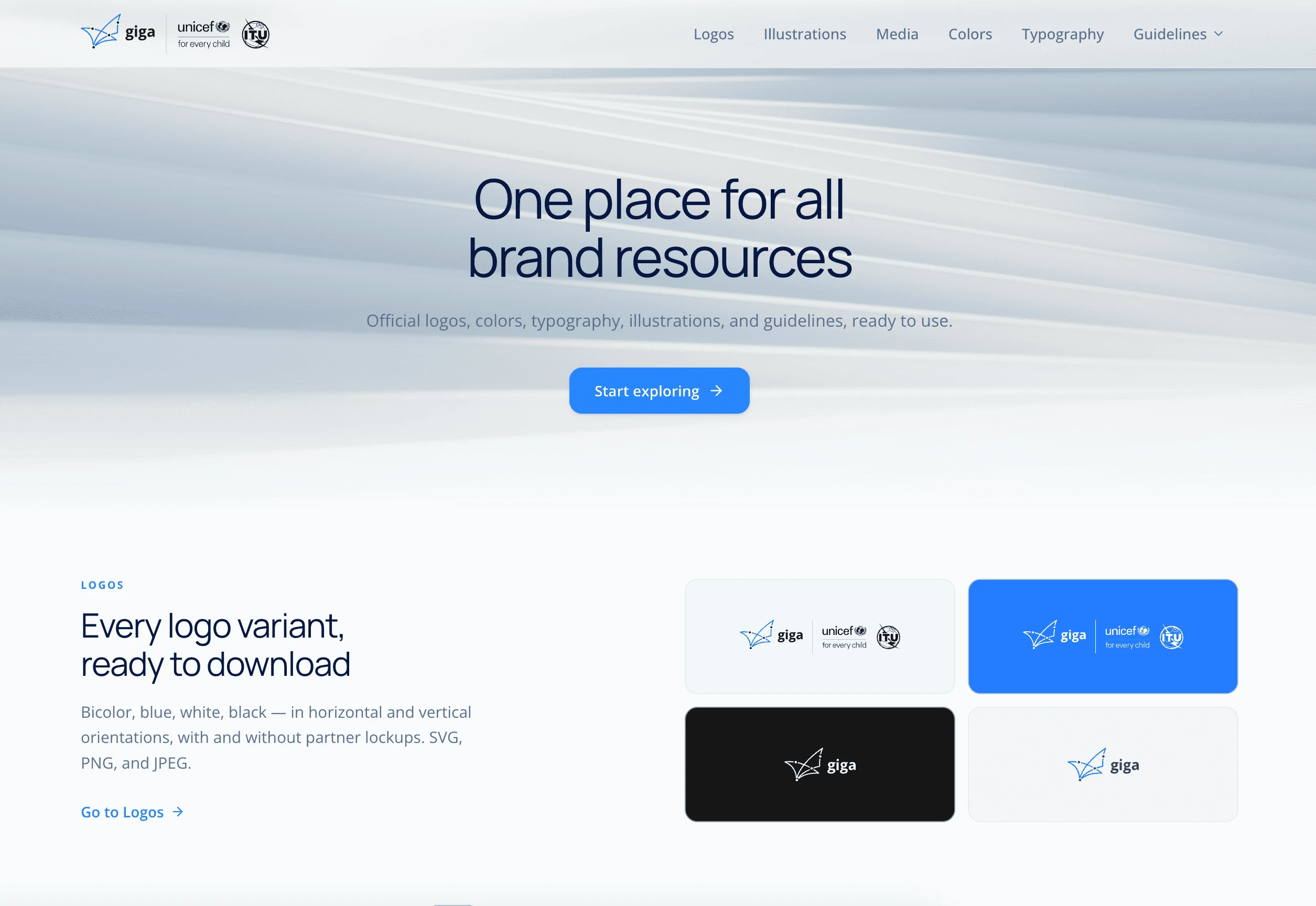
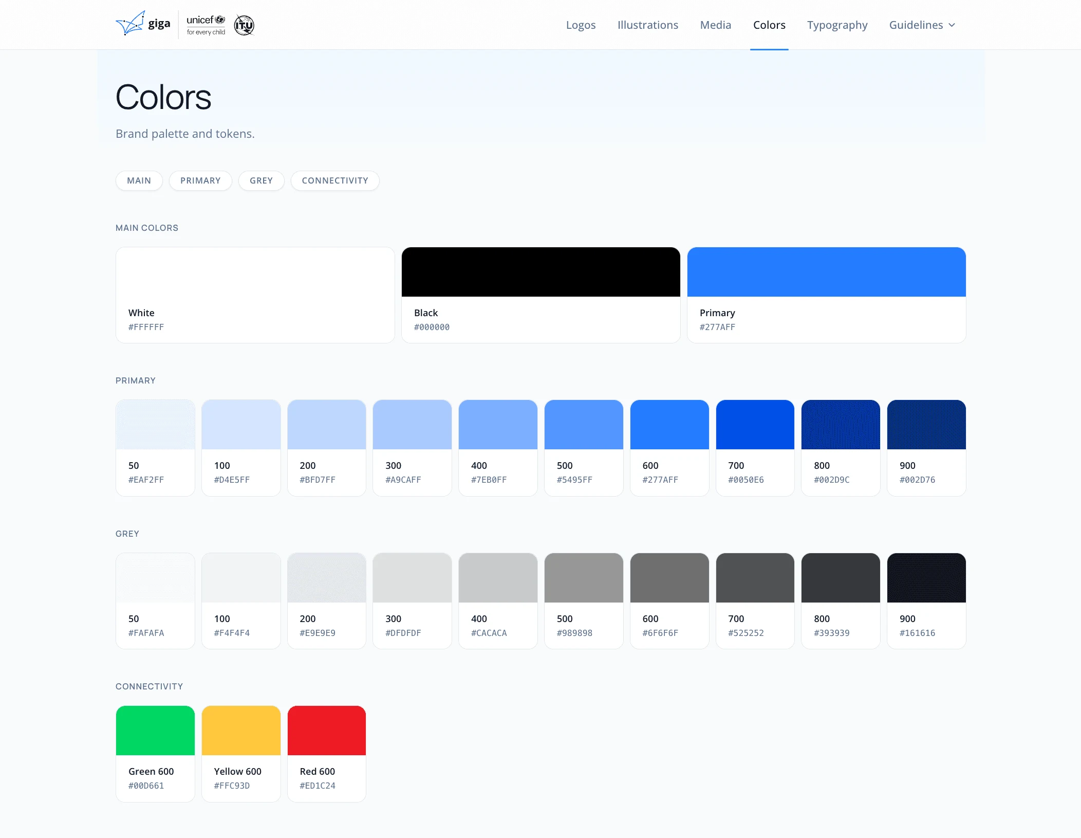
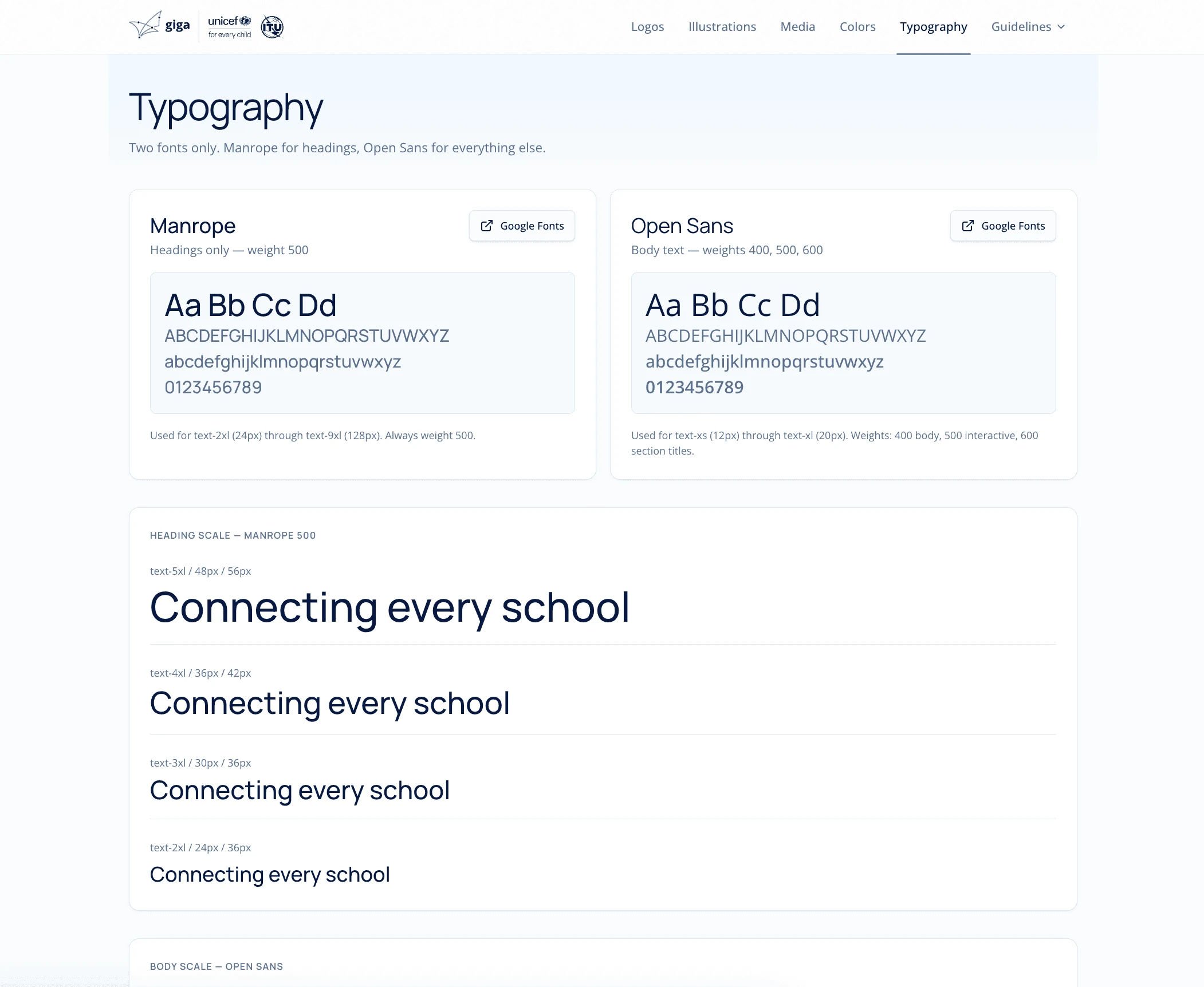
2. Color and typography reference. A live brand reference section with copyable hex codes, font names, and usage examples. No more digging through Notion pages or asking the design team for the primary blue.
3. Video brand guidelines page. A dedicated section documenting Giga's video identity: motion principles, lower third specs, color usage in video, and export formats. Built as an embeddable web component and integrated directly into the app.
4. Design System Launcher. A companion tool that pre-injects Giga brand specs into AI design tools like Cursor, Lovable, v0, and Claude, so any colleague building a new product starts with the right design system already loaded.
Measured impact
Numbers from Hotjar. People don't drop in for a hex code and leave. They stay and work with it.
- Eliminated recurring asset delivery requests to the design team
- Single source of truth for all logo variants, colors, and typography
- External partners access assets autonomously without needing an internal account
- Brand consistency improved across communications, decks, and partner materials
- New joiners onboard to the brand without design team involvement
Impact over time
- Reduction of off-brand materials in external communications
- Faster onboarding for new team members and partners
- Foundation for a fully scalable digital brand hub as Giga grows
What is new since the first version
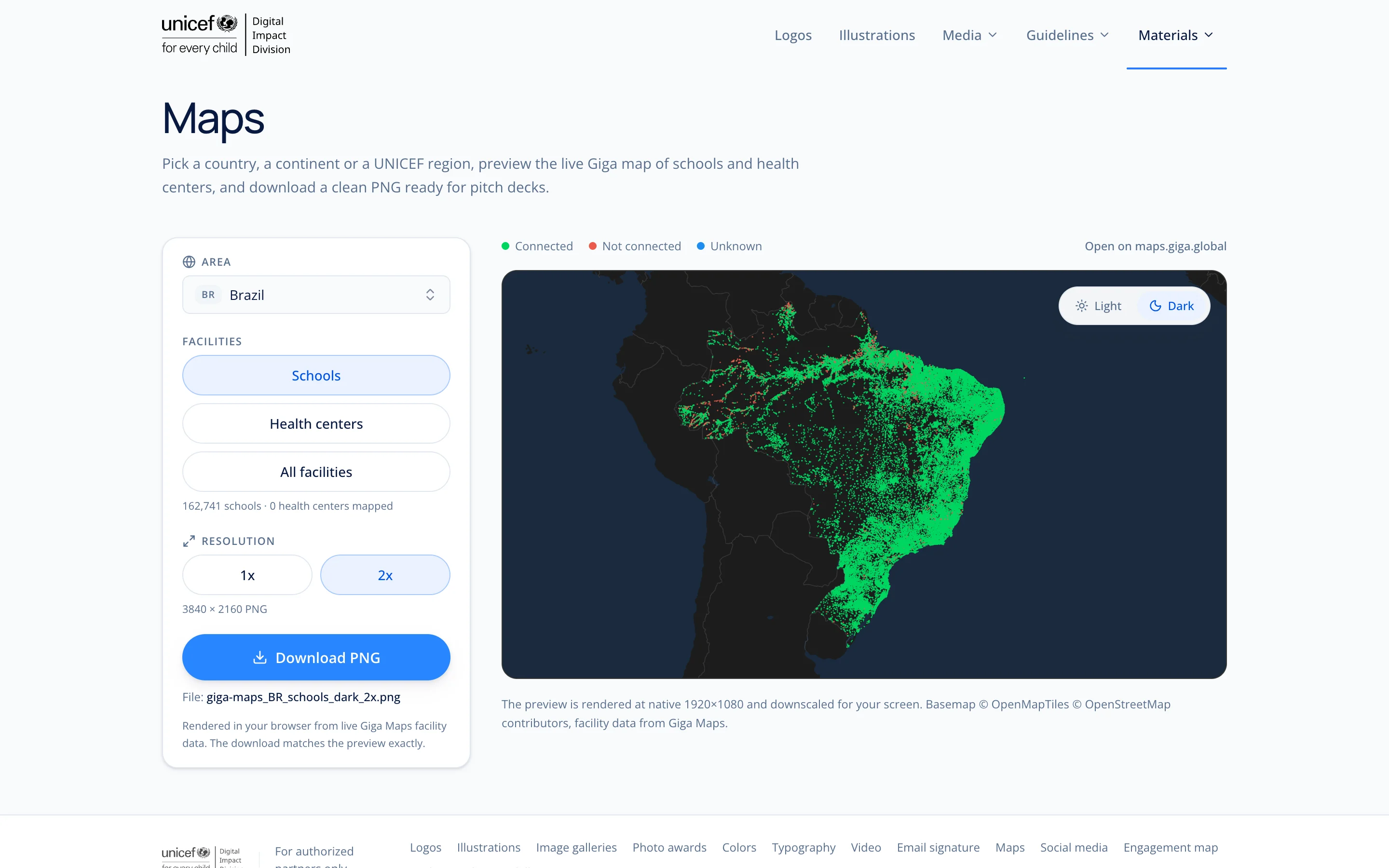
- A Maps page that renders the map in the browser and exports a PNG at 1x or 2x. The first version photographed the live map from a server with no GPU, and the exports came out empty.
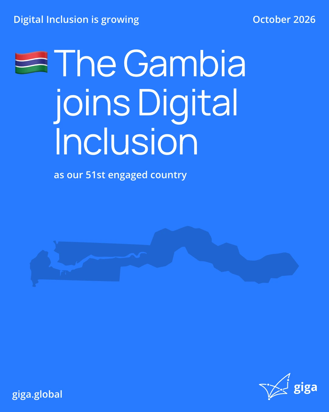
- An engagement map whose PNG export looks the same on every machine, because the fonts are self hosted and the export waits for them.
- More maps. Continent, world and UNICEF region maps sit next to the country maps, with schools, health centers and all facilities as separate layers. The basemap keeps only national borders and hides place names, so the map stays clean when it lands in a deck.
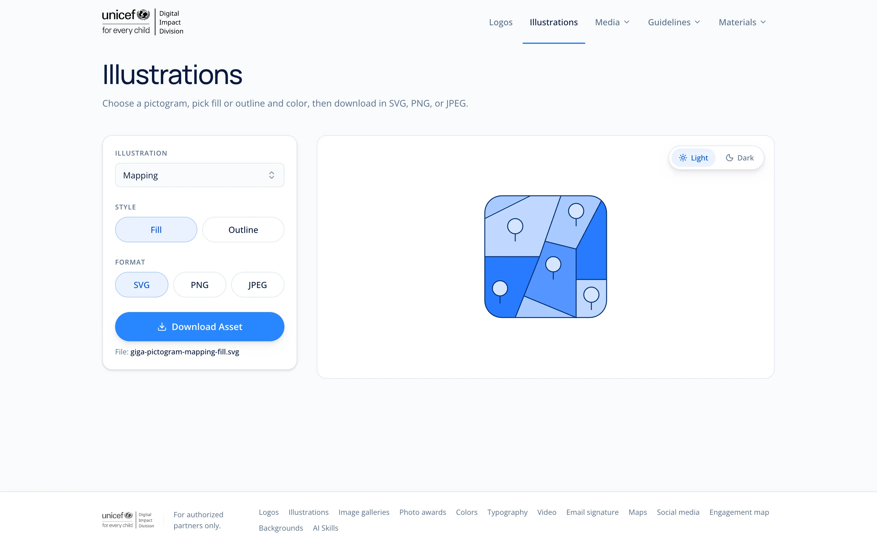
- A searchable illustrations picker that matches on keywords, and a product logo for GigaSpatial in black and white.
- The Launcher gained a deck design system skill, with skills ordered newest first and the author credited on its own line.
- The site now carries the Digital Impact Division lockup as its logo, and Giga becomes Digital Inclusion in all visible copy.
More screens