Billo
The reskin of Billo, a restaurant point of sale used every day by hundreds of venues, delivered as a clickable web prototype for the product owner and a generated handover for the Flutter developers.
- Role
- Product designer, freelance
- Period
- 2026
- Stack
- Next.js 16React 19Tailwind 4Flutter handover
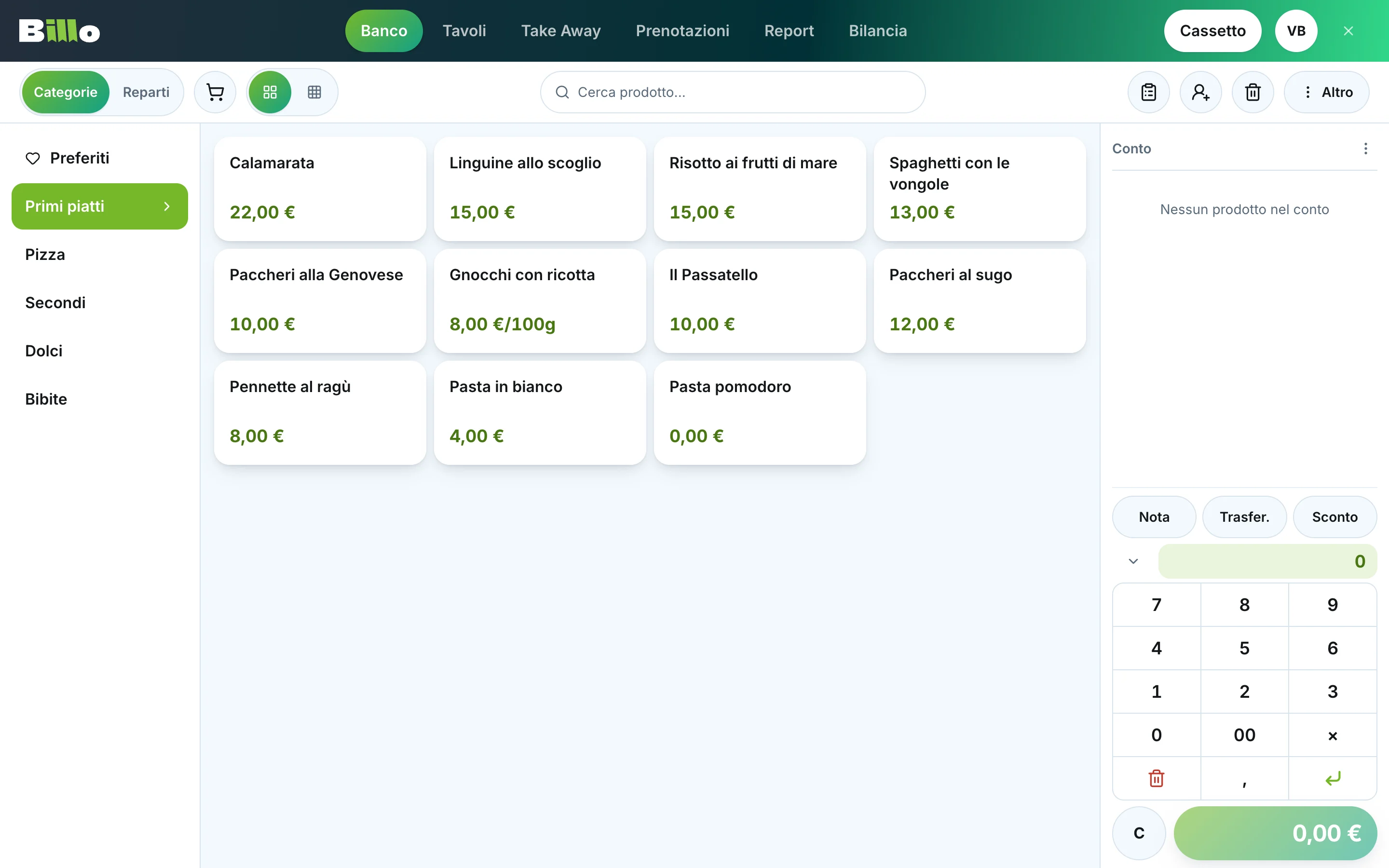
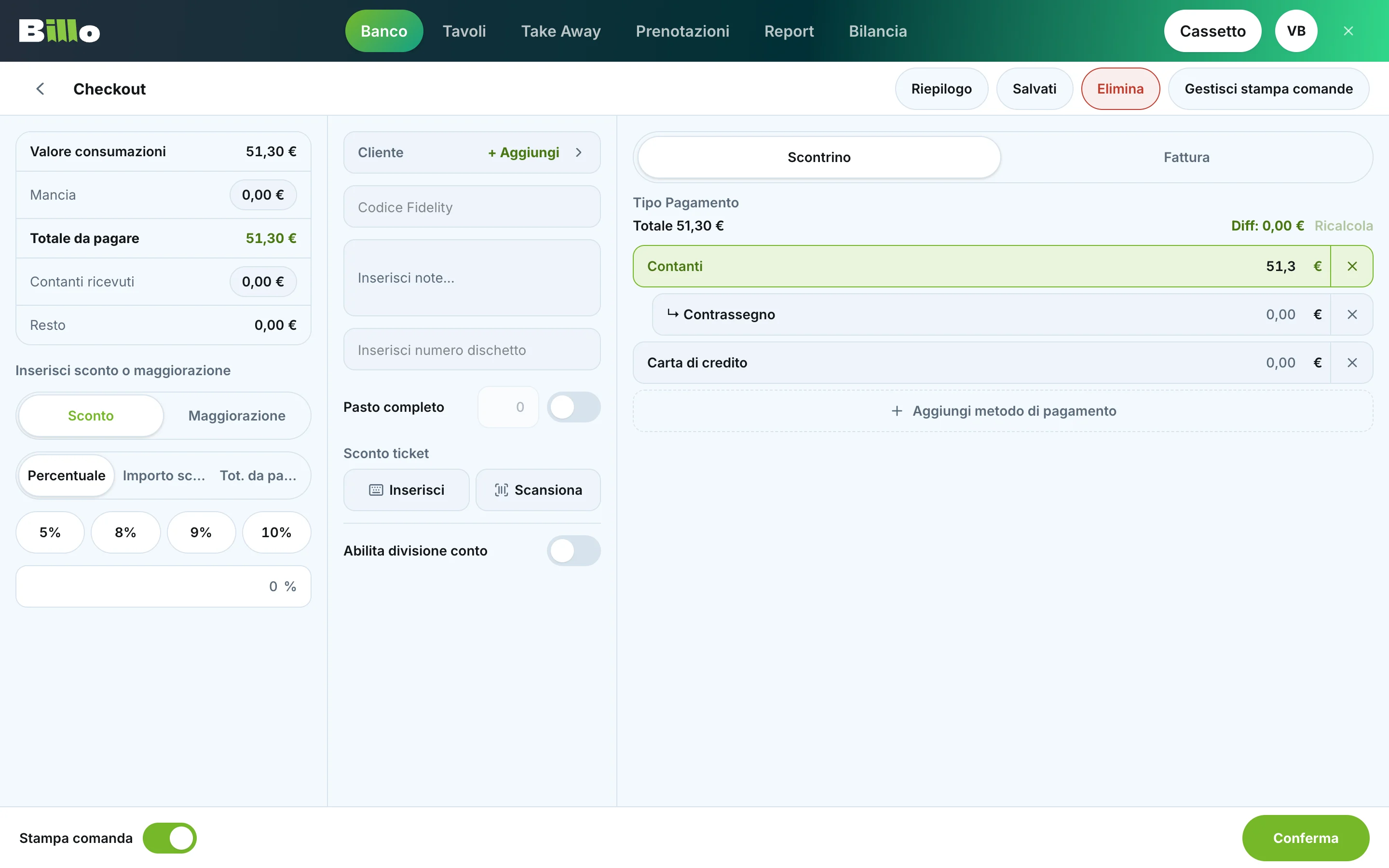
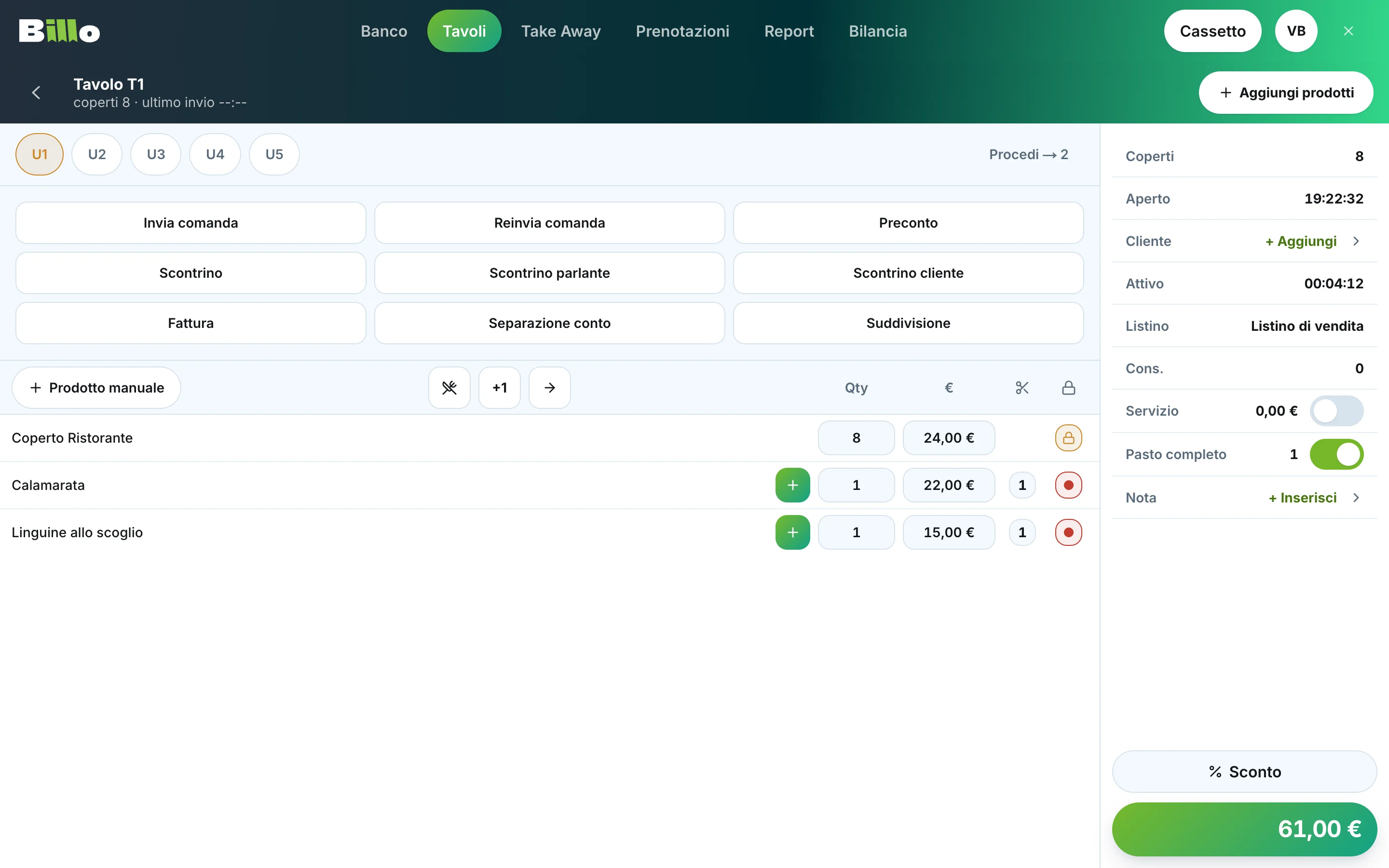
I redesigned the interface of Billo, a restaurant point of sale, the software behind the counter, the tables, take away and reservations of hundreds of venues. Same actions, same flows, a cleaner and more consistent skin. Delivered as a clickable web prototype and as a handover the Flutter developers can build from.
The context
The product is built in Flutter and runs on touch POS terminals at 1024 by 768, and on iPads for a minority of venues, always in landscape. I had no access to the code, only to the running app. The team sent me screen recordings, annotated screenshots and voice notes, and I turned them into screens.
The constraint
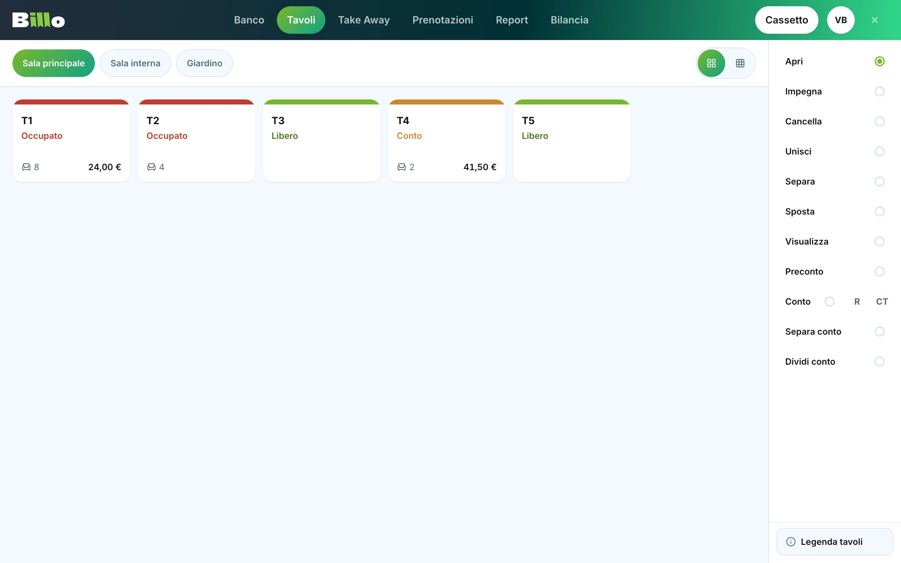
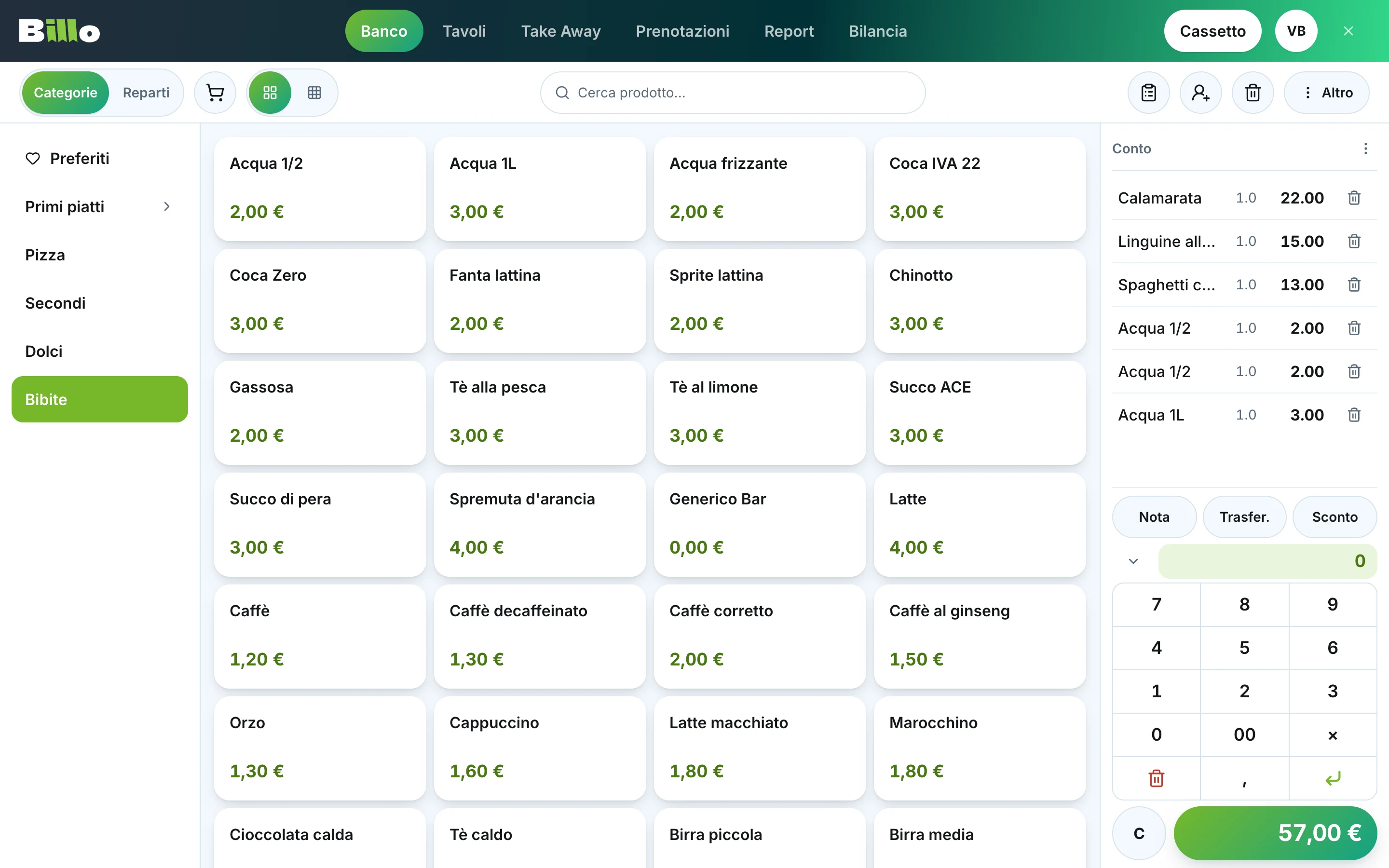
Hundreds of venues use this software every day, during service. Staff know where every button is. So the brief was conservative: nothing moves, no flow changes, every existing action stays. What improves is the rest. Tabs always on top with a visible active state. Labels on icons. One family of buttons, modals and numeric pads instead of five. Error messages that say what to do.
How I approached it
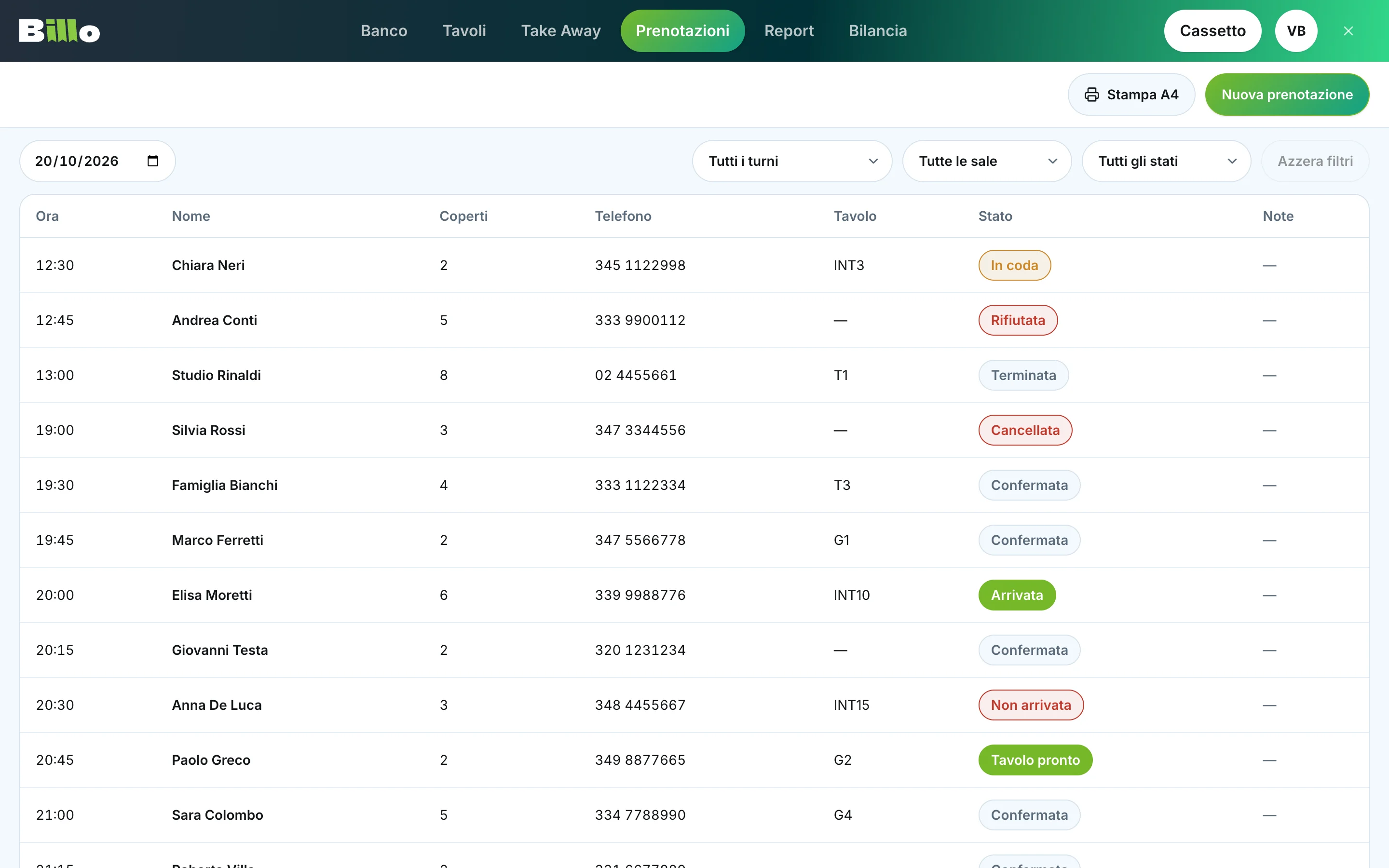
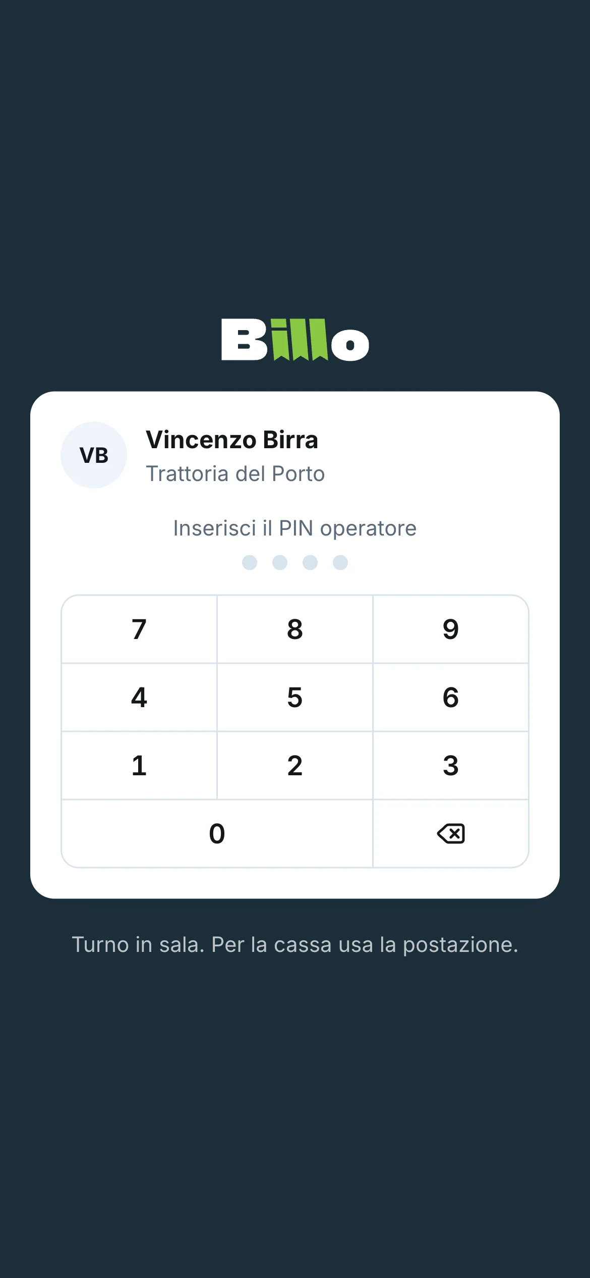
I could not click the real app: it is wired to a printer and a cash drawer. So I rebuilt it as a web prototype, section by section, from the recordings. Counter, tables, take away, reservations, checkout, reports. Then a waiter app for phones, with long press on table actions and swipe to delete.
Each iteration went to production, the product owner tested it on the real terminal, and the feedback came back as voice notes. A few rules came out of that loop and now hold everywhere:
- The primary action is always on the right.
- No label above a select when its default option already names the filter.
- "Reset filters" is always on screen, disabled when there is nothing to reset. It never appears and disappears.
- Minimum text size 14 pixels, minimum touch target 44 pixels, because the terminal is touched with wet fingers during service.
- Inter as the typeface, because the system font of the tablet is not available in Flutter.
Let's take a look
The prototype is the spec. Every component carries a marker, and a script reads the markers and generates the handover: design tokens as a Dart file and as JSON, a CSV of components with their states and behaviour, a CSV of every text field, and the icon set exported as SVG. If a component is added without its behaviour card, the build fails. The developers never work from a screenshot.
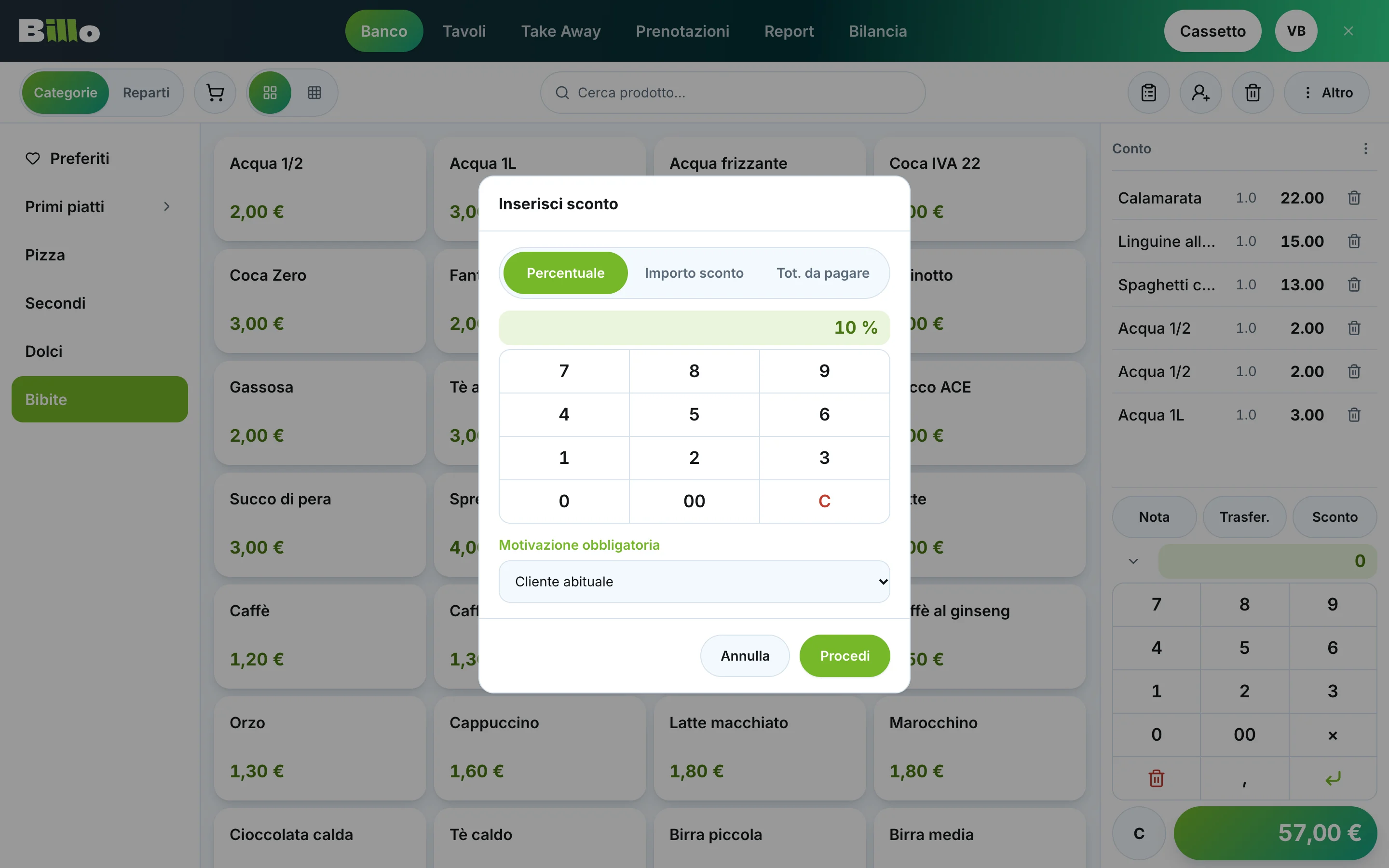
Details that took a while to get right: the numeric pad drawn with lines instead of borders, a discount slider that shows the discount under the total, variants as a catalog of ingredients with plus on the left and minus on the right, and a hidden counter mode for the owner. On iPhone the keyboard broke the layout, because dynamic viewport units ignore it: the fix was a fixed body and a custom height taken from the visual viewport.
Impact
The reskin took about ten days, from the first recordings to a prototype the developers could build from. The biggest gain is in tapping. The old app was hard to hit with a finger, so now every touch target is at least 44 pixels and every icon has a label.
The new version is in beta testing, rolled out to about twenty restaurants.
More screens