Role
Product designer
Teammates
Product manager
Client
The challenge was to optimize a landing page for loan comparisons, with a focus on paid traffic from SEM and Facebook CPC campaigns. The page was primarily accessed via mobile devices, which made up 80% of the total traffic. Despite high traffic, the page suffered from a 40% abandonment rate, and only 75% of users reached the third scroll. Furthermore, registered users had a 30% higher conversion rate compared to non-logged-in users.
The need
The challenge was to optimize a landing page for loan comparisons, with a focus on paid traffic from SEM and Facebook CPC campaigns. The page was primarily accessed via mobile devices, which made up 80% of the total traffic. Despite high traffic, the page suffered from a 40% abandonment rate, and only 75% of users reached the third scroll. Furthermore, registered users had a 30% higher conversion rate compared to non-logged-in users.
Goals
Identify areas of improvement in the existing design.
Deliver a modern, conversion-oriented design with a fresh visual appeal.
Let's take a look
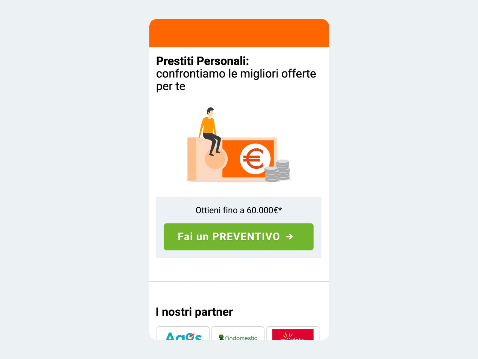
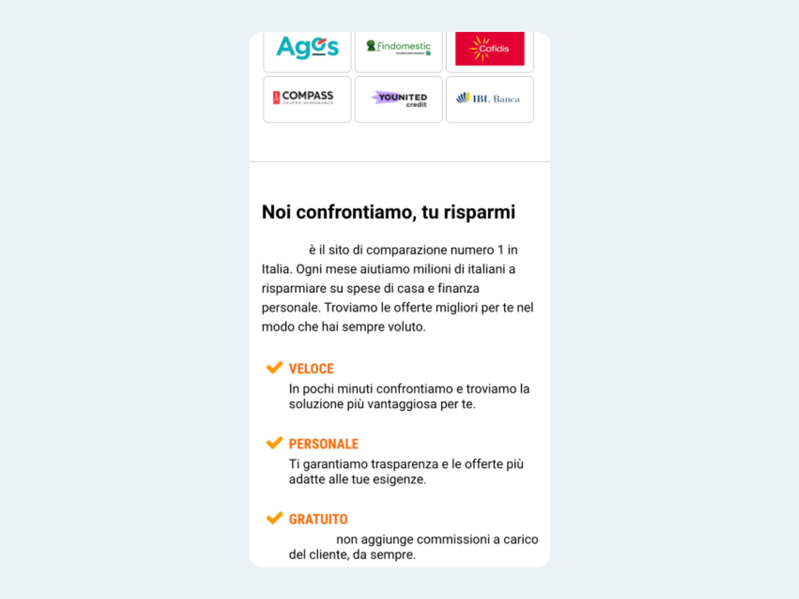
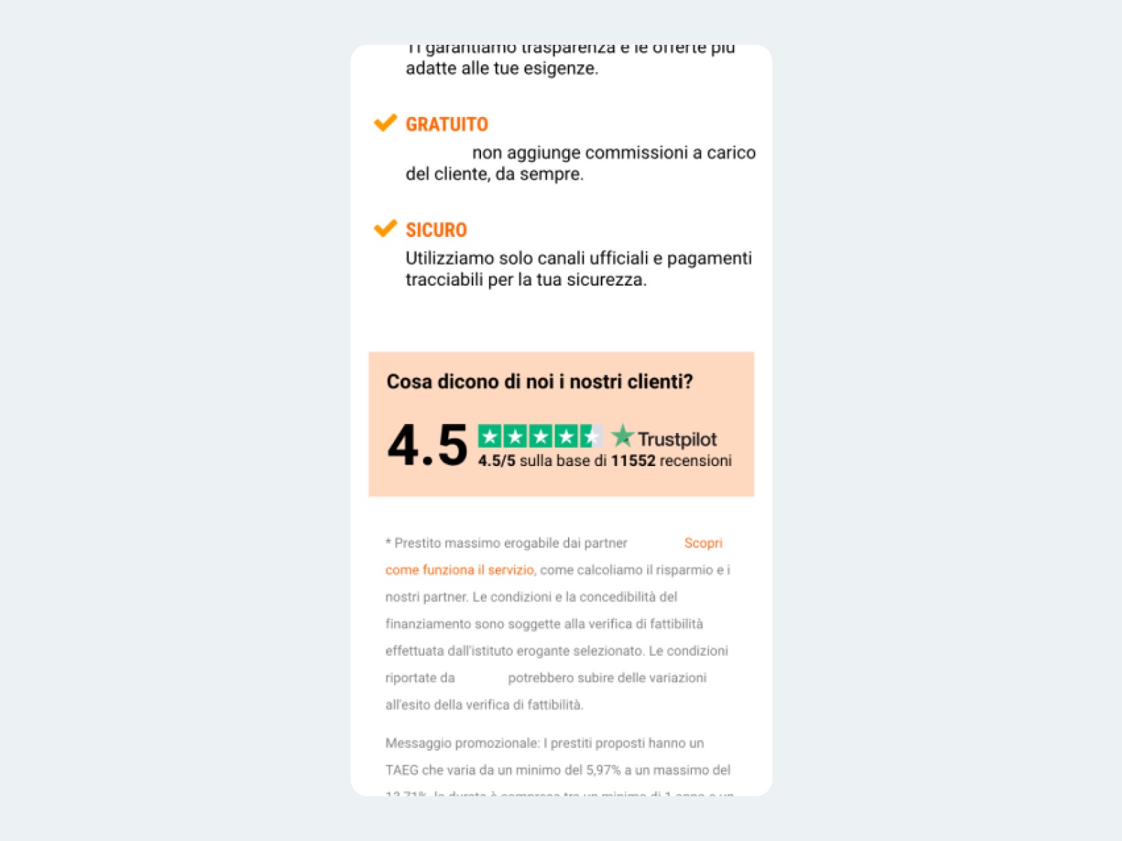
Here’s a breakdown of the previous landing page, focusing on its mobile experience:
First scroll: The first scroll presents several issues: the keyword “Confronta” lacks emphasis, the illustration doesn’t align with the main message, and the CTA text fails to clearly convey the action. Additionally, the hook “Ottieni fino a 60.000€*” is not compelling enough, and it would be more effective to specify the number of partners, such as “Confronta tra +500 partner,” to enhance clarity and engagement.

Second scroll: In the second scroll, it is recommended to highlight key phrases, such as “sito di comparazione n°1 in Italia,” using bold text for better emphasis. Additionally, the strengths of the service should be made more clear and visually appealing by incorporating icons to make the information more digestible and engaging for users.

Third scroll: In the third scroll, the Trustpilot box has too much visual prominence, which distracts from the main call to action (CTA). Additionally, the sticky CTA text should be consistent with the button text at the top of the page to create a cohesive and clear user experience.

That's all right, but what do users think about this page?
I conducted a usability test using Maze, with 34 participants engaging in a realistic scenario—choosing a loan for home renovations. The test revealed the following:
Button Engagement: Participants rated their likelihood to click the buttons at an average of 6.3/10.
Trust: The page inspired a moderate level of trust, with an average rating of 5.8/10.
Clarity of Message: 87% of users found the message of the page to be clear from the start.
Reading of Strengths: 57% of users did not fully engage with the key selling points, indicating that the strengths were not immediately noticeable or impactful.
Open comments revealed what users didn’t like:
Confusion over which of the two CTAs to click.
The sticky green banner hindered text readability and disrupted the user experience.
The button captured too much attention, overshadowing the rest of the page’s content.
Mistrust of phrases like “up to” in financial offerings.
An overload of information and logos distracted from the primary task of comparing offers. Users found the CTA misleading, unsure if they were comparing or getting a quote.
Solution space
Based on these insights, I designed a high-fidelity mobile-first prototype with key improvements:
I bolded important text in the title and key messages, such as “Confrontiamo le migliori offerte,” to immediately engage the user.
The CTA text throughout the page was made consistent to avoid confusion. Both the hero section and sticky CTA now guide users with the same message.
The Trustpilot rating was placed next to the CTA, adding credibility and a secondary point of engagement without distracting from the main action.
Partners were displayed with a transparent effect to give the impression of continuity, reinforcing trust without overwhelming the user.
Core selling points (e.g., no hidden fees, secure transactions, quick comparisons) were placed next to the CTA to boost clarity and urgency, encouraging users to act.


A/B Tests
After implementing these changes, I proposed to run a series of A/B tests, focusing on different CTA wording, highlighting key strengths, and modifying the partner display.
Conclusions
This redesign transformed the landing page into a conversion-focused, user-friendly experience. The clean layout and optimized CTA flow enabled users to compare loan offers more effectively, increasing both engagement and conversion rates. The project not only modernized the design but also significantly improved overall user satisfaction and business metrics.